KEITH WILSON
Hyde Park Apartments (2010)
Publication & Exhibition
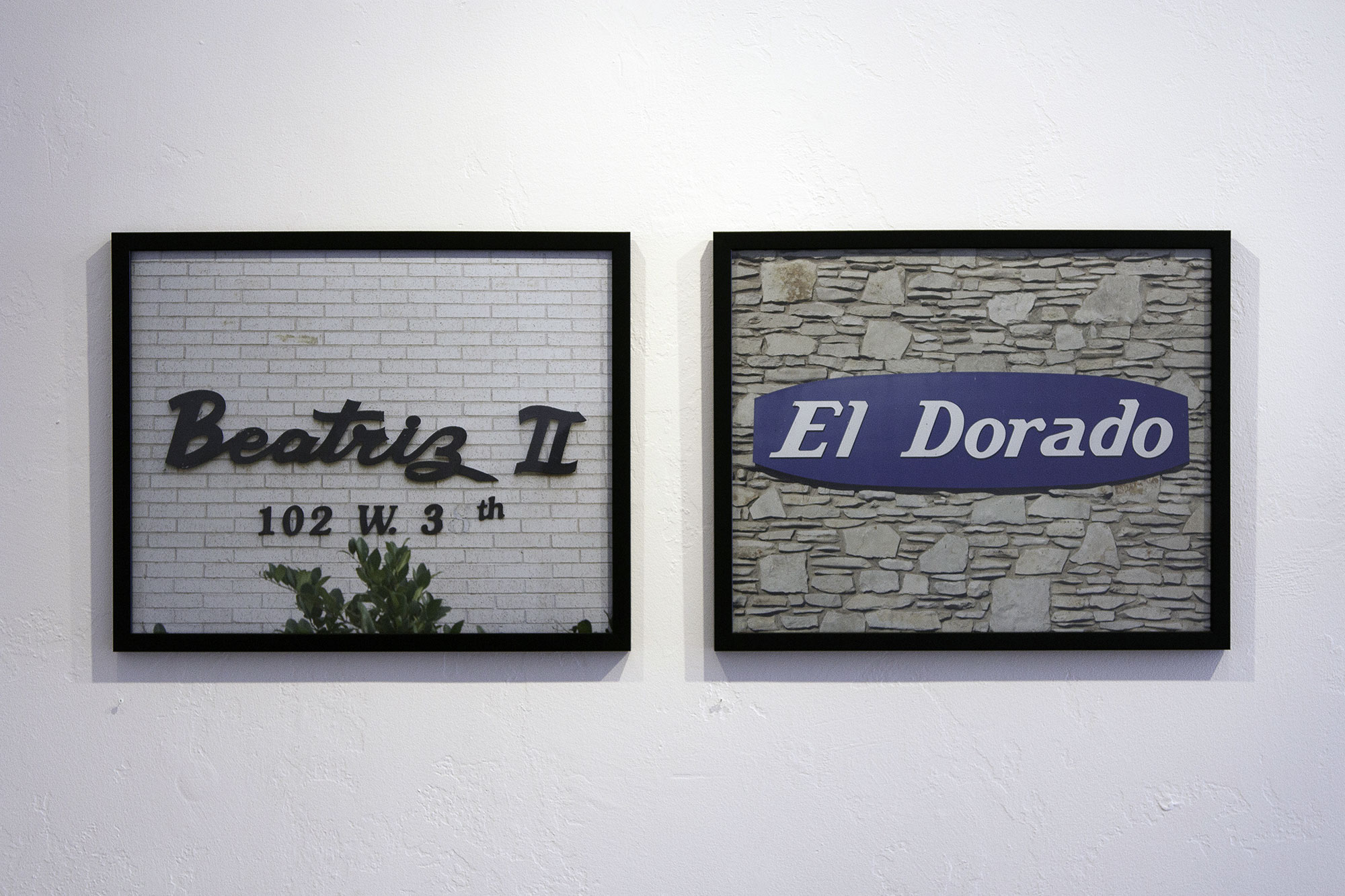
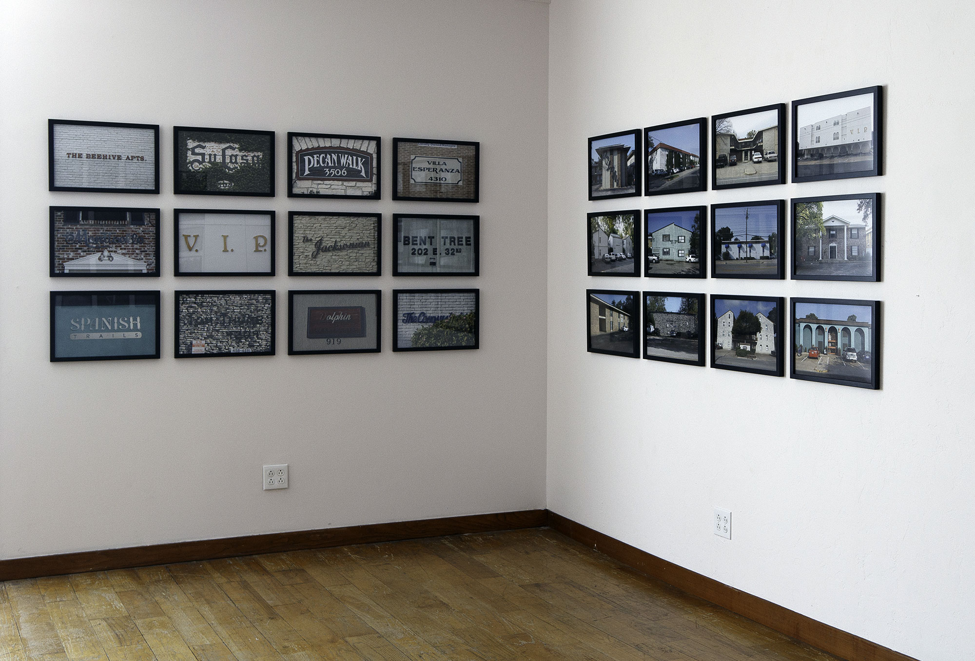
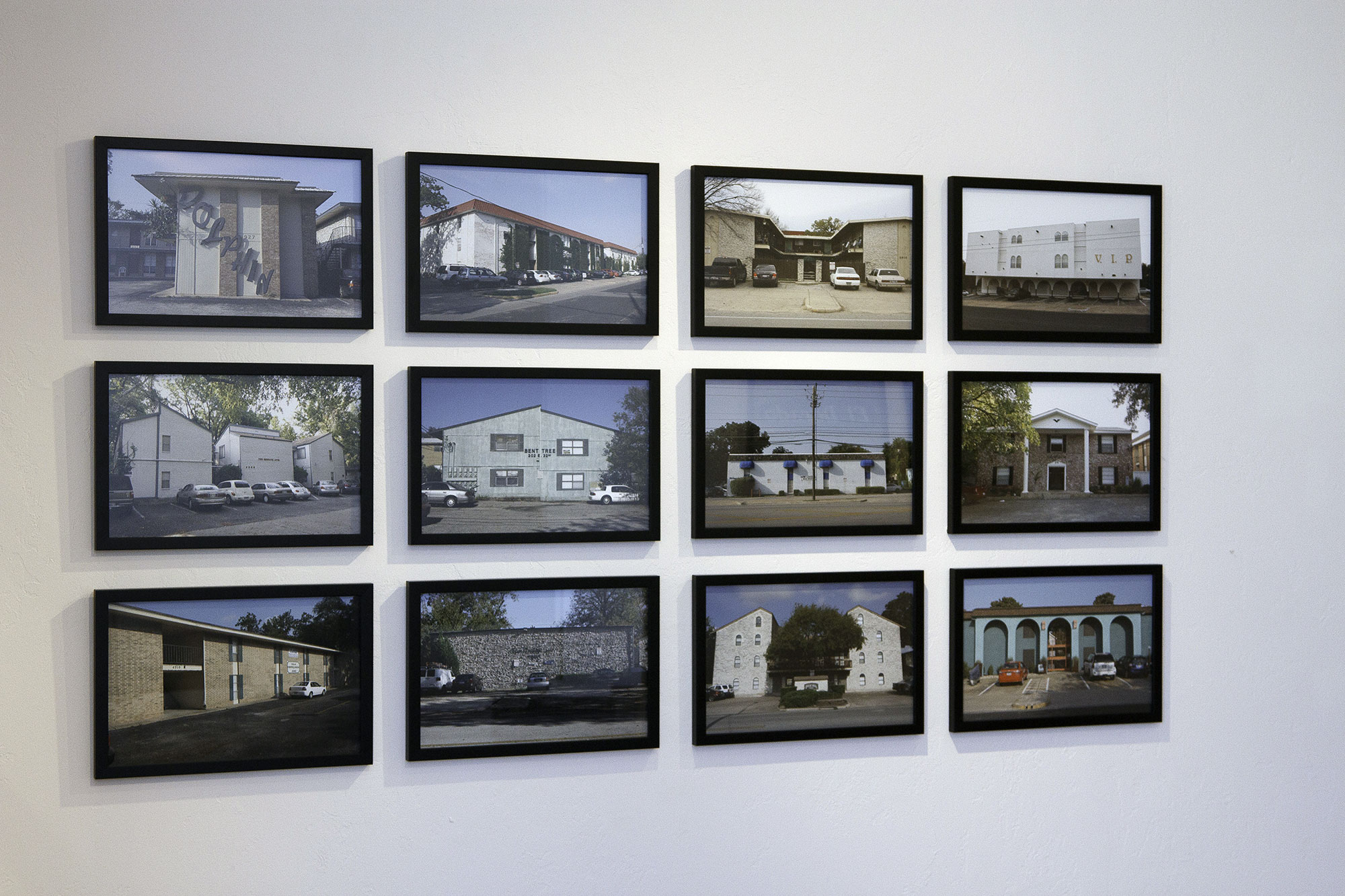
A visual taxonomy of apartment residences in the Hyde Park neighborhood of Austin, Texas. Composed of 95 full-color photographs, this contrapuntal sequence juxtaposes the buildings' fanciful names with their quotidian appearance.
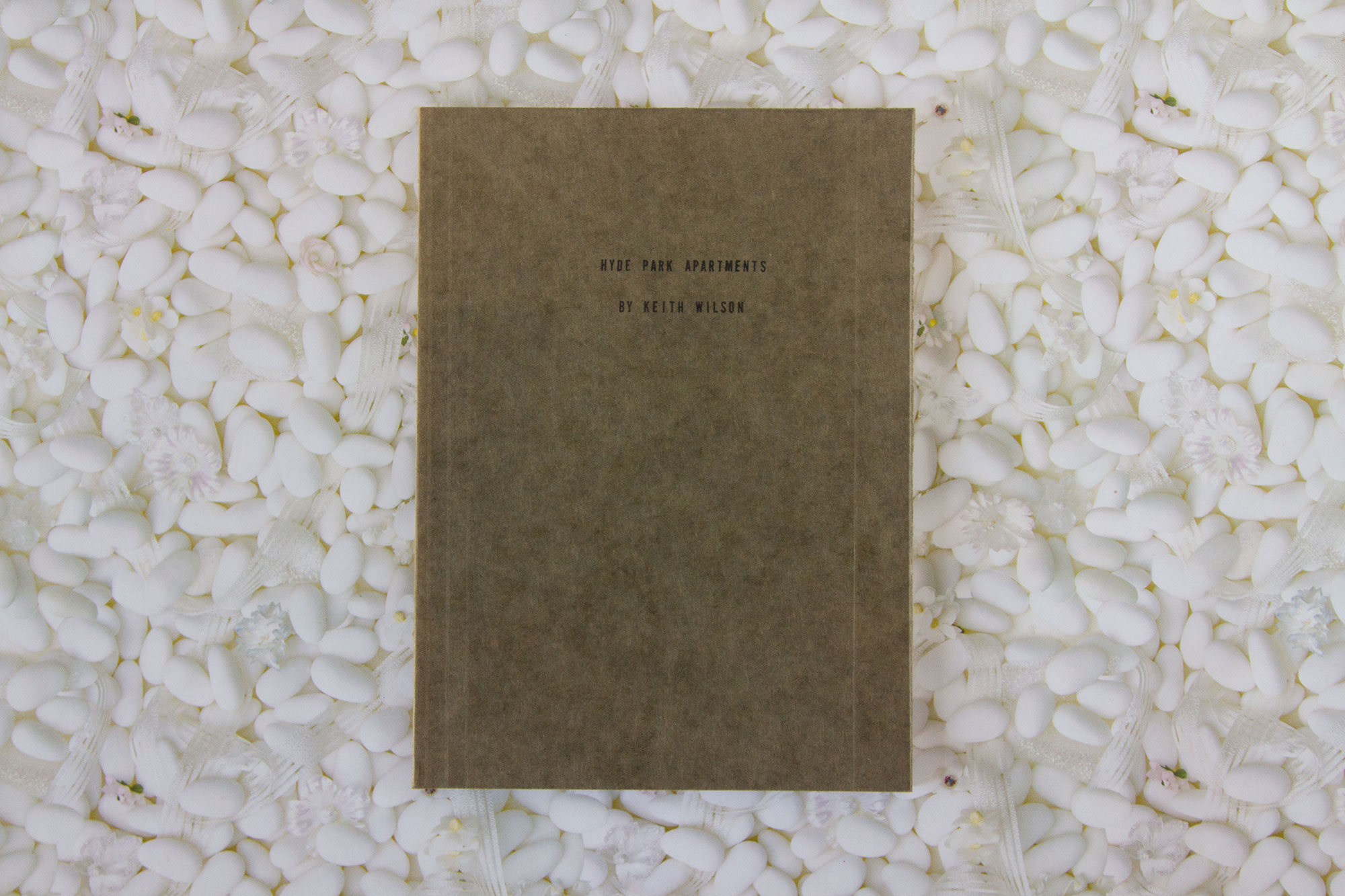
A 98 page book of the series is available from Publication Studios/Breezy Circle.
Press
ArtForum Critic's Pick (pdf)
Publication Studio Interview (pdf)
Hyde Park Apartments is a visual taxonomy of an Austin, Texas neighborhood and its various apartment complexes. Flat-footed, everyday photographs of slightly run down stucco and brick structures are paired with fanciful titles such as “V.I.P,” “Spanish Trails” and “The Jacksonian.” Inspired by Ed Ruscha, Lewis Baltz and Bernt and Hilla Becher, the series records ongoing attempts to evoke the ideal through aggrandized nomenclatures.
It took me several months living in the Hyde Park neighborhood before I noticed what Berndt and Hilla Becher might describe as a typology: a high percentage of the apartment structures, built mostly in the 60s, 70s, and 80s, were named, and those names were advertised on their facades. Most people, myself included, drove, walked, biked, texted or iPhoned by them without noticing. Then... in walked Ed Ruscha whose early photography books encouraged me to document these structures in unsentimental and serial form. This body of work is by no means high on the originality scale, rather, it continues a conversation that Ruscha began in Los Angeles decades ago. I’m using his strategy to document a beautifully banal architectural phenomenon in a much less (until recently) mythologized location.
People don’t want to just live in an apartment, but in a villa. They don’t want a parking lot but an arbor. They want to do more than pay rent, they to aspire to a lifestyle. I’m fascinated by the degree to which these naming display efforts are successful (or not!). In some cases the name, the font, the façade, and the architecture coalesce into a “living experience”: The Beehive, The Monticello. In others, nothing works: Bent Tree,The Del Prado.
The book Hyde Park Apartments, published by Publication Studio, presents 47 apartment diptychs. The apartment names (on the left side) extracted from their context (on the right side) emphasizes the disconnect between the advertised and the actual. When closed the two come together. Whether it’s a kiss or a collision is a matter of opinion.
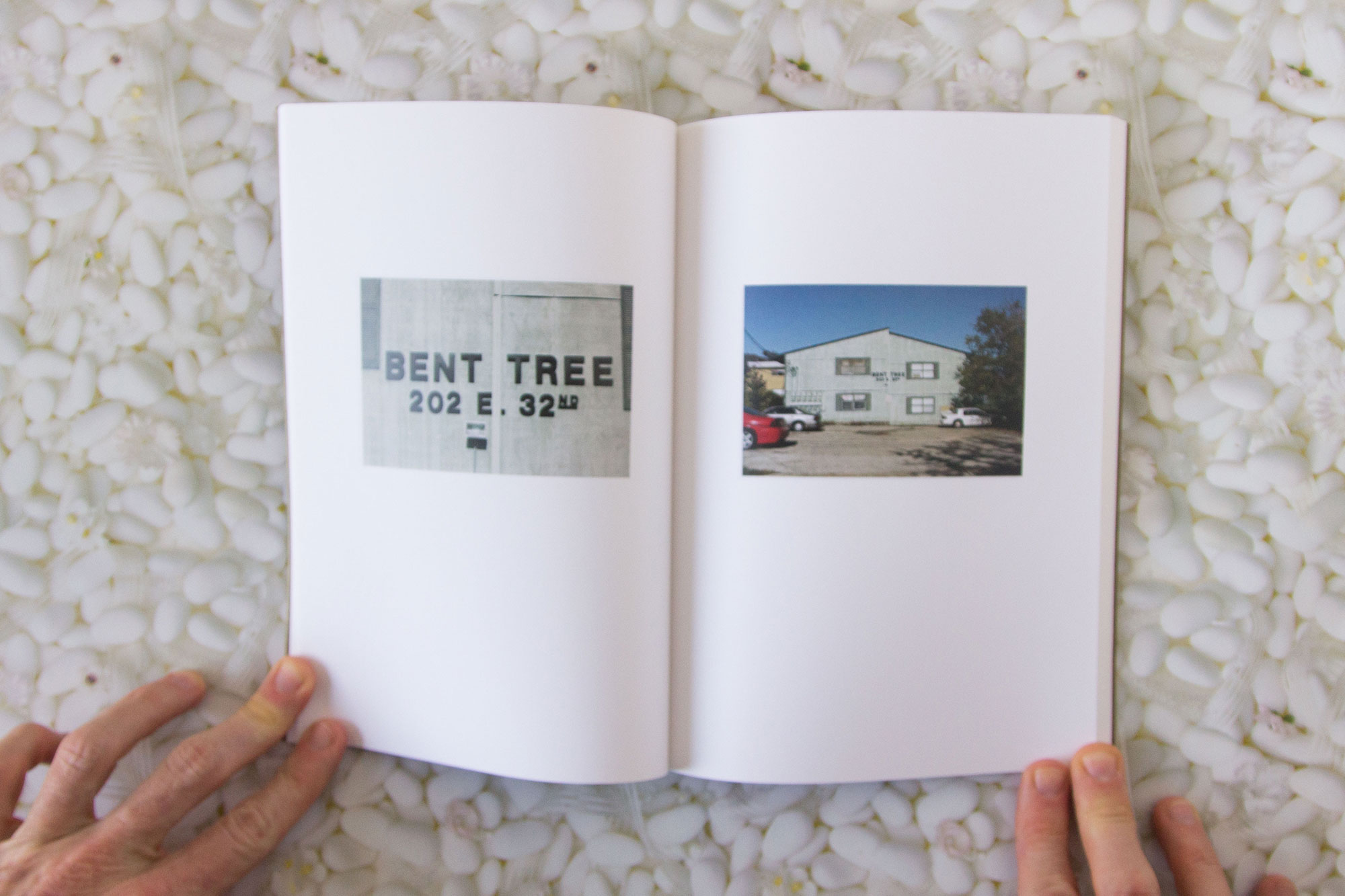

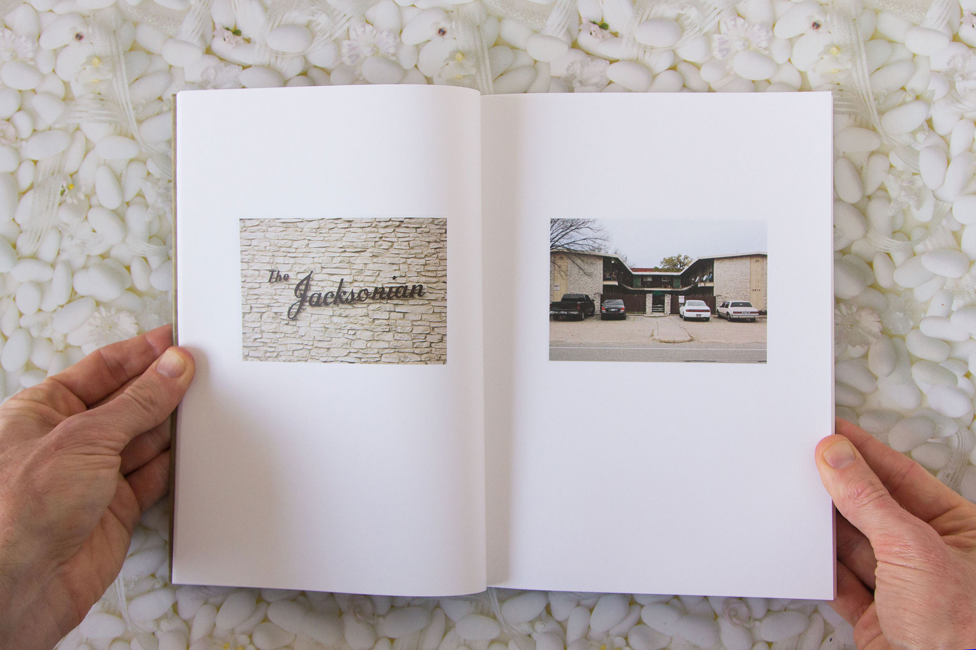

Sign + Structure Dyptichs


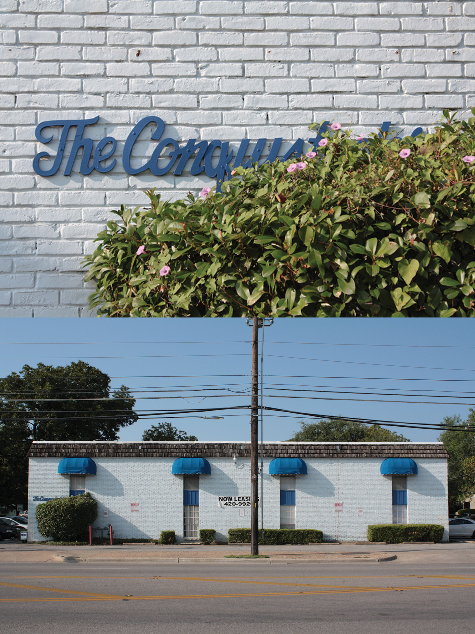


Review: ArtForum
Keith Wilson
SOFA
301 East 33rd Street #7
October 31–December 17
In this exhibition, Keith Wilson puts himself in dialogue with Ed Ruscha’s early photographs of banal architecture. After touring the Hyde Park neighborhood of Austin, Texas, on foot, Wilson produced eighteen straightforward pictures of apartments in the area, works that are largely displayed in pairs here—one long shot of each Hyde Park apartment complex, and one perfectly centered shot of the complex’s logo in situ on the building. The accompanying artist’s book couples the images in the same way, creating a sequential part-whole relationship between graphic text (the logos) and architectural form and pattern (the buildings themselves). Eschewing the coolness that sometimes set apart Ruscha’s early work, however, Wilson focuses on the buildings’ obvious, often failed, and somehow endearing middle-class touches. Pastel-painted facades evidence halfhearted renovations. Letters in kitschy fonts cling to aging clapboard and stucco sidings. All these irregularities help to syncopate Wilson’s formula, and the works feel sincere despite their art-historical freight. The fact that this gallery is located inside an actual Hyde Park apartment reinforces this sense of reverence. One close-up, The Jacksonian, 2009, hangs above a green vintage couch. The work’s titular and compositional focus is the complex’s name, and the graphic qualities of the font eclipse the viewer’s cynicism about the name itself (a nod to the Jacksonian era in American democracy; only a few viewers will know that the Jacksonian is also the name of a Baptist church on the same Austin street as the apartment). One can choose whether to dismiss this combination of aged, repaired, revered, and revisited material, or to enjoy the delights of Wilson’s ad hoc tourism.
— Katie Anania
Installation Images
Martina Johnston Gallery, 2013
